I Thought Dark Mode Would Be Easy
My website worked. It's technically done. So I thought: let's just add one more thing.
Dark mode.
Developers love that right? I didn't even use that many colours - it should be quick to swap them around. And yet, it turned into a full-system refactor: it was typography, code highlighting, images and rendering behaviour.
It started with organising colors
Sure, it didn't help that I hardcoded colours directly into Tailwind utility classes. A heading had a specific hex value, and a paragraph had another. To change the theme, I would have had to update each of these individually. No, thank you.
So I introduced CSS variables.
At first, I defined variables like hover-dark and hover-darker. That worked until I tried to invert the theme for dark mode. What would hover-darker even mean in dark mode?
This forced a different way of thinking. Instead of asking "What color should this element be?", I had to ask "What role does this color play?"
So I switched to variable names that were semantic, rather than literal:
--text-primary--text-secondary--background--border
With this, a heading wasn’t “black” anymore. It was text-primary. A background wasn’t “white”. It was background-primary. This sounds like a minor adjustment but it changed how I approached the theme design entirely. I stopped thinking in terms of individual colours across themes and focused instead on the role and intention of each element, with colour as just an implementation detail.
At this point, I thought I was mostly done. I wasn’t even close.
Dark mode is not black
So I had a system of CSS variables. Now I just had to invert it: black to white and white to black. Except it looked terrible. Who would've thought that having white text on black would feel so... bright? It was harsh, hard to read, and everything started blending together - almost like I had suddenly developed astigmatism.
It turns out dark mode isn't really black and white. It's shades of grey (though thankfully less than 50 of them). Instead of white, I used a light grey and text was miraculously legible again. For secondary text, even lighter grey worked perfectly. I'd assumed that contrast alone would make text readable but that's not quite true. Pushing contrast to the extreme with white text on black backgrounds was a disaster. What I needed to learn as well was how to tune that contrast, making it proportionate and layered.
And that's all my problems solved, said no one ever.
Every surface breaks differently
Even with a colour system in place, the UI still did not look right. Different parts of my website broke in different ways:
Typography (Tailwind)
I was using Tailwind’s typography plugin (prose) for my writing pages. It worked well in light mode. But once I introduced my own variables, the defaults started conflicting with my system.
Headings, links, and inline elements were all pulling from Tailwind’s internal colour definitions instead of mine. Some styles updated, others didn’t. Removing or overriding one rule would fix one element and break another. The abstraction broke down, and the complexity I’d tried to hide came rushing back.
To fix it, I explicitly mapped Tailwind’s typography variables to my own. Instead of relying on defaults, I treated typography as part of my system.
Once everything pointed back to the same set of variables, things became predictable again.
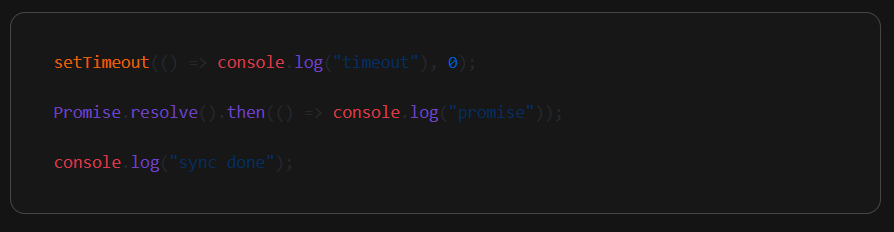
Code syntax highlighting
I use a lot of code snippets, especially in my JavaScript event loop article series. With dark mode, syntax highlighting introduced a different kind of inconsistency.
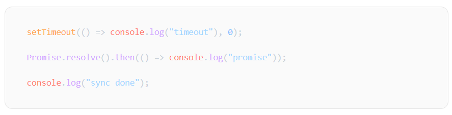
I started with Github CSS - too bad it didn't look great in dark mode. So I switched to Github Dark CSS - only for it to look off in light mode. Who would've thought?
For a while, I assumed I had to pick one, and even considered the side quest of defining my own palette that would somehow work amazingly for both light and dark modes.
Eventually, I realised the obvious solution: use both Github and Github Dark CSS and switch dynamically based on the mode. It sounds pretty obvious now, but at the time, I genuinely thought I had to choose.
Images
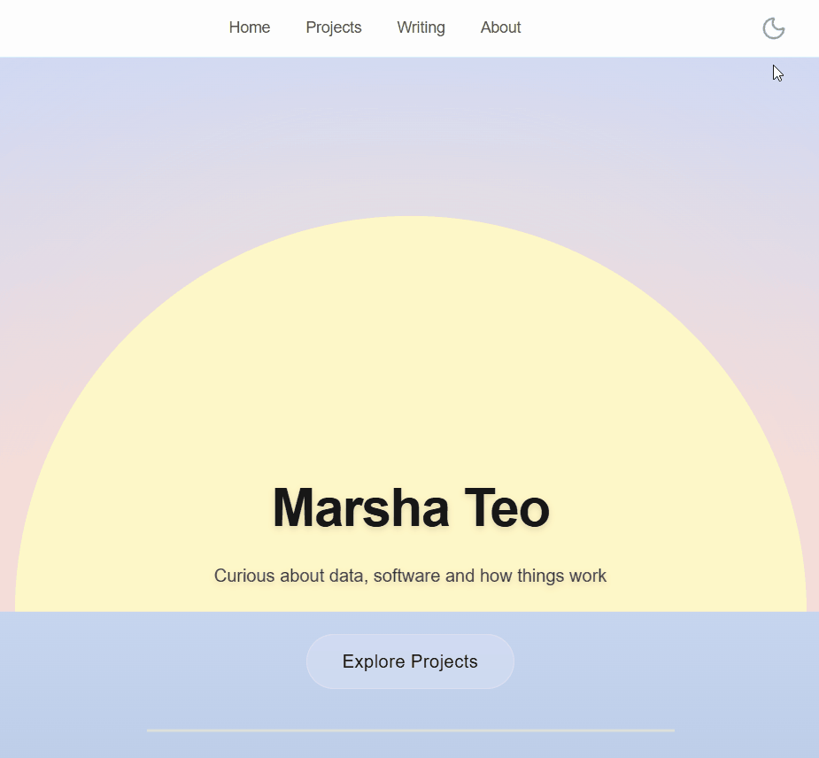
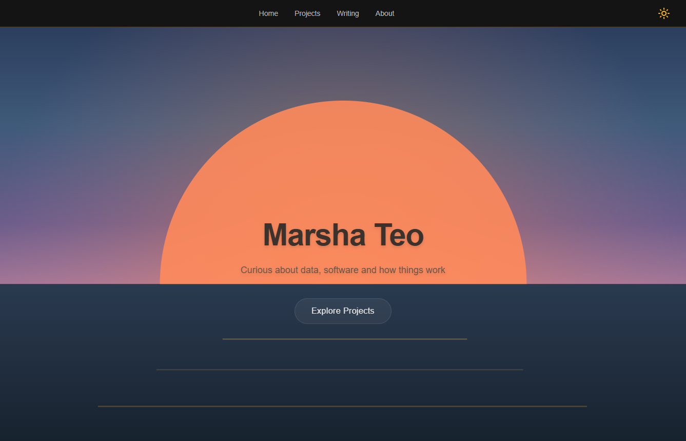
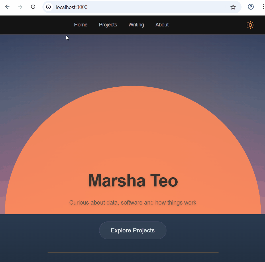
Oh, I was looking forward to this part: customising images in dark mode. My hero image is of a sunrise. From the start, I imagined using a sunset version for dark mode. Did I create dark mode just so that I can use this image? Maybe.
Thankfully, this was easily implemented by including both images and switching between them based on the mode.
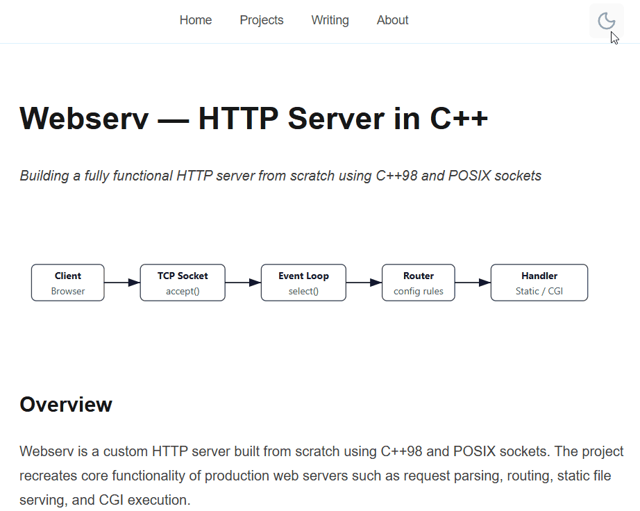
But then I realised I had other images that did not translate as nicely. I had not anticipated having to fix the colours in these images at all. I use SVGs for my diagrams, and tried making their colours dynamic using CSS variables but I couldn't make it work.
So I did the same thing as the hero image: two versions of each diagram, one for each mode. It felt less elegant at first, but it worked better. Turns out, not everything should be dynamically styled.
The problem wasn’t styling—it was timing
After fixing all that, I refreshed the page for my moment of victory. A flash of light mode appeared before it switched to dark. It was subtle, but definitely there. And yes, the temptation to pretend that didn't happen was definitely there too.
This turned out to be a rendering issue. The theme was being applied after the page rendered. By the time the correct theme was set, the browser had already painted the wrong one.
Dark mode needed to be applied before the UI appeared, not after. Fixing this meant moving the theme logic earlier, so the correct state was known at the moment of render. It was a small change, but it changed how the entire page felt.
The end
I thought I was adding a feature: a toggle button and a visual enhancement that sits on top of everything else.
But dark mode didn't sit on top of my UI. It ran through it and every part of the system had to agree. None of the above was individually difficult. But together, they revealed that dark mode was a system, rather just a simple feature.
Thanks for getting to this point with me. After all that, I'm really proud of dark mode, and in no small part because of the toggle button.